February.
Workshop session and the application of formal analysis.
I look, I feel, I
think, I understand and then I see.
In the library session this month we work-shopped a
selection of student-submitted photographs and Greg Klassen lead the
viewing process. Here for the first time the class leaned to evaluate
images in a formal way. Rather that critiquing in a purely personal
reaction sort of way ( “I like”, or “I would do it this
way....”) he introduced a step by step process suitable to a
seminar group such as this. We wish to understand, to learn, to
really see, rather than simply apply our personal
biases. The process he used was parallel to the terms I used in a
previous 'extras' post ( see the above quote).
The
process.
- At first we simply look at a photograph and assign some preliminary personal evaluation of how we feel: “perhaps, yes, no, huh (?)”. These 'gut reactions' are appropriate to this stage, but this first 'take' is not an unnecessary step because that first glance is all important. A photograph presents an image of a 'thing' and that and how it is presented can be what we first react to.
- Later we come back with a different mind set and analyze the photo as to its formal ( as in form) design elements. How is it organized, how has the photographer/artist crafted his image and what do they tell the viewer about the intent, the idea that lies within? This may seem a painfully academic exercise to those of us who simply wish to come to a swift judgement and move on, but because this process forces us to think in an analytical manner it slows us down and draws our thoughts towards the internal logic, the pattern and structure of the image. Hopefully we now understand why the image/idea has been presented within this particular structure of lines, forms colours and so on. This process, by the way, can be applied to painting, sculpture, and writing equally well. Imagine examining a sculpted three-dimensional piece to more fully understand why the artist has formed his piece of stone in this particular way, or why a poet has used a particular form and imagery.
- We then proceed to put our first impressions together with our formal analysis and see how they are related. How closely do our original gut reactions coincide with the way the image was constructed? We are applying a critique ( and that does not mean a criticism) at this point, so perhaps our first impression was simply ill informed. But then again perhaps there is a disconnect between the idea and how it was presented? For the purposes of this exercise we must assume that the artist knew what he were doing, so this is not a 'slag the artist' moment ( none of this process is a critique of personality). We need to apply every bit of knowledge, both the feeling and thinking kinds, and be prepared to follow the maker a long way down their path. In truth, we may end up understanding the idea, and ourselves in the process, more fully but perhaps differently than the photographer could have imagined.
- Then, finally, is the moment to check the artist's statement, and title of the piece and to gather any extra information available ( like other work by this artist, or the 'ism' within which he works) and put everything together. We have arrived at a synthesis and we can now truly SEE the photograph, the poem, or the painting. In the process we have leaned much about ourselves, our personal imagery and how to co-ordinate the formal elements of design so that what we 'think' is what we 'say'. We learn through examining other work by other minds that we do have certain perspectives that are different from others and that how we see is not the only door on perception.
Extras. The role I have taken on for this seminar series is to discuss the 'craft' aspect of photography, so here is a view into designing images both as we take them and how we choose to process them.
Here are some examples I have chosen from my own collection to illustrate the
'formal design,' part of the above process. We will continue to
examine the theory of design ( or composition) as the year unfolds.

This is so minimalist, so evenly textured, that the
small triangular shapes assume a major role. Does that mean that we
can skip along quickly to the next image or is this simplicity
deceptive? Does the maker expect us to first feel and then think
about something here?
Notice the poise and stillness of this balanced design.

In terms of elements there is a great deal more happening here, lines tones, shapes etc., but is there not also a stillness even though the design may not be balanced in a formal way? Or is it? Perhaps feeling is a useful tool for us to use here to begin our process of understanding and eventually seeing this image.
.jpg)
Foreground, mid-ground and background, each with a
common white element to tie all these strong horizontals together.Notice that this is a vertical format that is composed of receding horizontal elements. ( the waves help)
.jpg)

I went to some trouble to sharpen the thorny twigs and the soften and lighten the sky. Working with contrasts like this can be very productive. The careful placement of the forms of sticks and clouds are all important, as are the tonal contrasts.

An accidentally blurry image to begin with, I applied maximum graininess to emphasis the textured softness and make this quality a plus rather than a minus.The eye follows the path towards the light. Notice the power of colour and texture to convey mood in this photo.

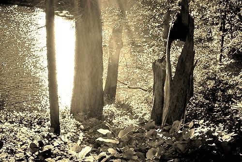
A purposely dramatic photo, but is the sun too dominant here? Notice how the rays reach right into the image. If drama is the story here though, then orderly balance would not tell this story well would it? (As an aside, I recently noticed an app. that will add flare to your 'perfect' image.)
Extra,
extra, read all about it! Homework.
While we have been focusing on 'reading' the artwork we
find that has been made by others - learning to SEE rather than
simply look and judge -, for the photographer the major benefit is in
learning to understand one's own work. When we can examine the
major forms, the dynamic qualities that give life and meaning to our
own photographs we have a valuable tool indeed.
When I set out to examine my own photographs for the
above series so that I could give some direction for others who are
setting out to learn design for themselves, I discovered things about
my own processes that I had not really thought of before. For
example, how difficult it is for me to not think within some creative
form of proportion and balance even when I am deliberately breaking
away from it.
As in this seminar series we are presenting a broad set
of ideas for our students to consider incorporating into their own
practice ( a widening of the horizon), my suggestion is that for the
next month you continue to regularly take photographs, like
practising the piano, and add to that an awareness of structure.
Become self reliant as a designer of images by developing the habit
of self analysis as you frame your image for the shot and later as
you process it on your computer.
How does the way you have chosen your subject, from what
angle, with what lighting affect how it communicates the idea you had
in mind? How will the way you process your image, how you crop it,
sharpen or soften, lighten or darken it affect what it communicates?
Your best tools for this are your twin capacities for
intuitive and rational thinking, how you feel and what you think and
how they can work together. That will carry you far beyond any
external set of 'rules for making good photos'.